We're not "real picky" about car numbers, but we'd really like to see them meet our meager guidelines set forth here:
Car Numbers
The most important words on that page are:
What does it take for a number to be readable from 200' away?We need to be able to read your numbers easily from at least 200 feet away.
- First, it has to be large enough for a person with normal vision to make out the digits. At 200', that's a minimum of 8" tall. But, it's not that simple. It also needs to be a "fat" font style with a wide stroke. Something like "Times New Roman" that's great for writing letters is way too narrow to be easily read at a distance. The font should also be fairly consistent in width, not a "fancy" font where the stroke varies from wide to thin. A few people either get lazy (Times font) or try to get too fancy with their fonts... Keep It Simple.
- Second, it needs to contrast with its background. A lot of people have trouble with this. You don't have to go all the way to "complementary colors" from a color chart, you just need to recognize that there are dark, medium and light colors and you need a lot of contrast for distant visibility at a glance. A medium color on a medium color does not contrast well, nor does light on light or dark on dark.
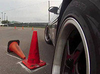
- CarNumber_Examples.jpg (332.31 KiB) Viewed 45394 times
18 - A little too small, font way too narrow, and text under number becomes "noise".
70 - Would be great if the window was tinted, but on clear glass, you have a constantly changing background. You got tape, you got a door... need I say more?
11 - Too small.
325 - Would be passable with white tape. Black on red = no contrast.
46 - Again, you got tape, you got a door...
10 - This one almost works, but black and red = no contrast.
224 - Too small, and silver is a such a strong "medium" color that it almost requires black or white to contrast with it consistently.
75 - Fancy font + Red/Blue doesn't work. Red and blue are generally not a good contrast.
27 - The "number bigger than the meatball" trick almost works, but it's not as easy to read as it could be. The addition of blue tape makes it nearly illegible.
07 - Way too tiny. (use some of that blue tape from the bumper!)
92 - This one is really close to "good", but you'll notice that it fades away at a much shorter distance than a same size bolder font.
757 - I only put this one in this category because this photo shows why you shouldn't use reflective material for numbers.
54 - Good use of tape and is legible most of the time, but this is a good example of how blue doesn't contrast with black.
50 - Too small, but great contrast and a good font almost make up for it.
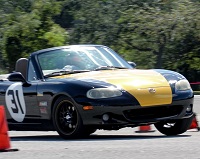
47 - Best blue tape numbers EVER. The blue/red contrast is poor in certain lighting, but the bold font and good size help a lot.
37 - Silver on red works.
72 - Classic black on white "meatball".
91 - Magnetic numbers, plastic doors? No problem!
20 - White shoe polish on a tinted window with legible script. Good!
69 - It doesn't get any better than this.
85 - White on black. Smallish, but legible.
777 - White on red. Also smallish, but legible.
21 - LARGE white on silver, legible even in poor light.
33 - Fluorescent green tape on blue. Can't miss it!
61 - Another classic black on white meatball, you can't go wrong.
31 - Giant "NASCAR" numbers. Timing loves this.
4 - Simple and legible.
181 - Good use of tape. Red/Blue contrast is still an issue, but if you make it big enough and bold enough... it can still work.
Footnotes:
As a club, we need to quit buying 1" painters tape. It doesn't make good numbers. When we buy for the tech box, let's buy 1.5" or 2" wide tape to encourage those who use it to make bigger numbers.
Tech guys, don't pass a car without legible (from 200') numbers. Make them fix it!